Online Waterfall Bar Chart Tool
Free online waterfall bar chart maker. Show how positive and negative changes build toward a final total, customize colors, and preview the result instantly.
Why It Works
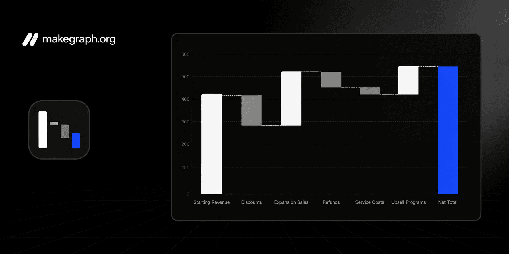
A waterfall bar chart makes each increase and decrease visible, so people can see how a starting value turns into a final total without reading a long financial table.
Break profit, cost, budget, or performance changes into clear step-by-step contributions.
Highlight which items added value, which items reduced it, and how large each impact was.
Use one compact chart to explain net change in reports, finance reviews, and operating summaries.
Product Highlights
Update the step names and positive or negative values directly in the built-in table without leaving the chart workflow.
The preview recalculates each bridge step and the final total as soon as you change the data.
Adjust the chart title and total labels.
Show or hide value labels, legend, background grid, and connector lines depending on how much explanation your audience needs.
Common Use Cases
Explain how quarterly revenue moves from starting bookings to final recognized revenue.
Show how planned budget changes into actual spending after each department adjustment.
Break down gross profit into discounts, refunds, shipping, and service costs.
Visualize how headcount, churn, and hiring affect the final team size.
Review operating income by listing gains and cost increases in one bridge chart.
Summarize KPI movement by showing which factors drove the biggest improvement or decline.
You need to explain how a total changes across a sequence of positive and negative steps.
The audience cares about contribution and cumulative impact rather than simple category ranking.
You want to connect a starting situation to a final result in a single visual.
You need a cleaner alternative to a table of variances or bridge calculations.
You only need category comparison and a regular bar chart is easier to scan.
You want to show continuous change over time and a line chart fits better.
Your story is mainly about part-to-whole composition and a stacked bar chart is clearer.
You do not have an ordered sequence of additions and deductions to explain.
Frequently Asked Questions
It is best for showing how a starting value changes through a sequence of gains and losses until it reaches a final total.
Prepare an ordered list of step labels and a numeric change for each step. Positive numbers increase the running total and negative numbers reduce it.
A regular bar chart compares categories independently, while a waterfall chart connects each step to a running total so the audience can follow cumulative change.
Yes. Negative steps appear as downward contributions so the chart can show costs, losses, deductions, or decreases clearly.
The final total bar shows the net result after all positive and negative changes have been applied in order.
This tool keeps the workflow lightweight: edit the steps, preview the cumulative bridge instantly, and export a clean PNG without a heavier spreadsheet setup.
Ready To Start
Enter your change steps, adjust labels and colors, and use the live preview above to turn variance data into a chart that is easy to present and easy to understand.