Online Marimekko Chart Tool
Free online Marimekko chart maker. Show category share with variable-width stacked columns, compare subcategory mix, and preview the result instantly.
Why It Works
A Marimekko chart uses variable-width stacked columns so readers can compare how large each category is and how each category is split across subcategories at the same time.
Column width represents the total share of each category, so the x-axis itself carries business meaning.
Segment height shows the within-category percentage, making mix shifts easy to spot without switching charts.
Use one chart to compare category size, part-to-whole composition, and relative relationships across groups.
Product Highlights
Update each category label and its three subcategory values directly in the built-in data editor without leaving the chart workflow.
The preview recalculates both column width and segment height as soon as you change the source values.
Control the chart title, legend labels, and color palette while keeping the output clean and presentation-ready.
Toggle data labels, legend, and grid lines to balance explanation, visual density, and export clarity.
Common Use Cases
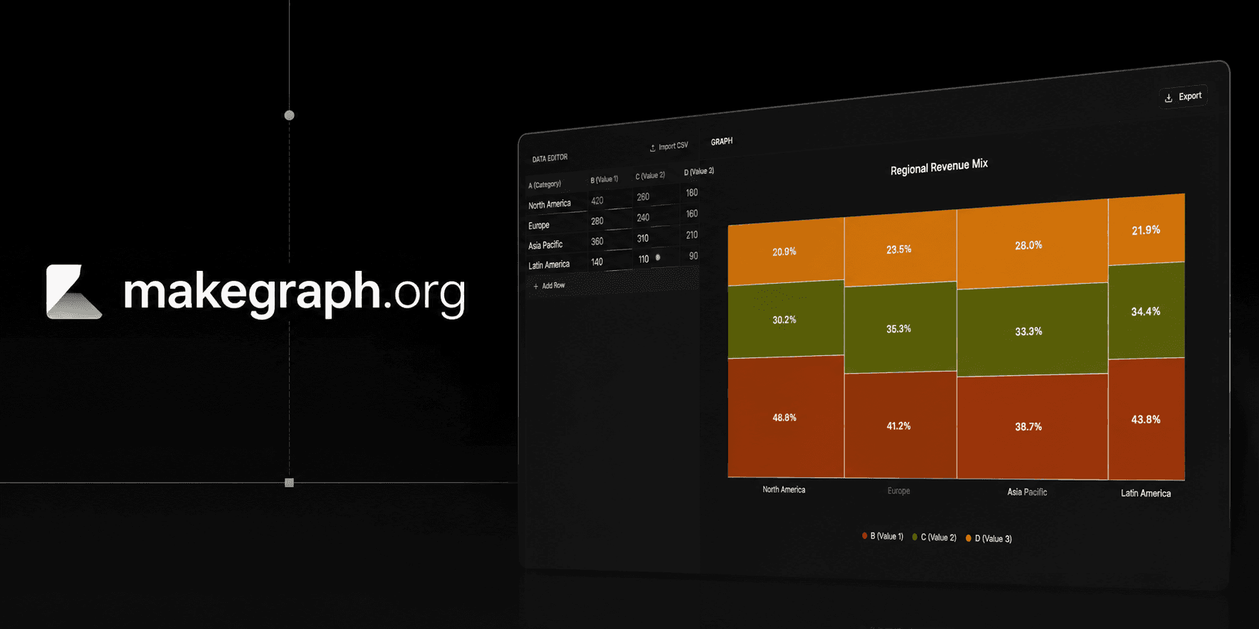
Compare regional revenue share while also showing how each region splits across customer segments.
Show category size in a retail assortment and the product mix inside each category.
Visualize market share by competitor and the channel mix within each competitor's footprint.
Summarize survey groups by population size and answer distribution in the same chart.
Explain how a total budget is allocated across departments and then split inside each department by spend type.
Present portfolio concentration by business unit and the composition of revenue, cost, or risk inside each unit.
You need to compare both category size and subcategory composition in one chart.
The category totals and the within-category percentages are both important to the story.
You want to reveal relationships between groups and the parts that make up each group.
Your audience benefits from a compact alternative to separate share and mix charts.
You only need simple category comparison and a regular bar chart is easier to scan.
You mainly care about within-category composition and a 100% stacked bar chart is clearer.
You need precise comparison for many tiny segments and a table or heatmap will be easier to read.
You want to show change over time and a line chart or stacked area chart fits better.
Frequently Asked Questions
A Marimekko chart is a variable-width stacked column chart. Column width shows each category's share of the total, and segment height shows the percentage split inside that category.
A stacked bar chart usually uses equal-width columns and focuses on total plus composition. A Marimekko chart also changes the column width, so category size becomes part of the visual encoding.
It works best with categorical data where each category has a meaningful total and that total can be split into smaller subcategories or segments.
It becomes harder to read when you have too many narrow categories, too many tiny subsegments, or an audience that needs exact values rather than pattern comparison.
They are closely related. Many people use Marimekko chart, Mekko chart, and mosaic plot interchangeably when describing variable-width category rectangles that encode percentage relationships.
This tool keeps the workflow lightweight: edit category values, preview the variable-width layout instantly, and export a clean chart without building a custom spreadsheet setup.
Ready To Start
Enter your category totals and segment values, adjust the labels and colors, and use the live preview above to turn a cross-category percentage story into a chart that is easy to explain.