Online Pareto Chart Tool
Create a Pareto chart online with ranked bars and a cumulative percentage line. Analyze defects, complaints, delays, and key causes with a clean 80/20 view.
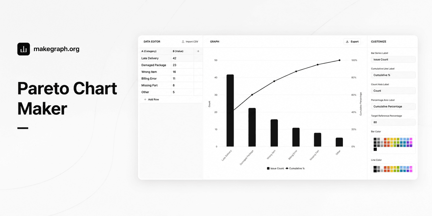
Why It Works
A Pareto chart combines a descending bar chart with a cumulative percentage line. It helps teams see which small set of categories explains most of the total impact, so decisions can focus on the few causes that matter most.
Use a Pareto chart when you need ranked category counts plus cumulative share in the same view instead of splitting the analysis between a bar chart and a table.
The descending bars reveal which causes are largest, while the cumulative line shows how quickly the top categories account for most of the result.
This format works well for quality control, customer complaint analysis, incident review, warehouse errors, and service improvement planning.
Product Highlights
Enter category names and counts in one table, then update the ranked Pareto view without leaving the editor.
Keep the classic Pareto structure by sorting categories from highest to lowest, or turn sorting off if you need to preserve your original order.
Add a reference line for the target cumulative percentage so readers can spot where the major few categories cross the decision threshold.
Adjust series names, axis labels, colors, legend, and grid without switching to a heavier spreadsheet workflow.
Common Use Cases
Rank defect types in manufacturing and show which few defects create most of the rejects.
Analyze customer complaints by reason and identify the issues that drive the majority of support volume.
Review shipping or logistics delays and see which causes explain most late deliveries.
Prioritize software bugs, outage causes, or support tickets based on total operational impact.
Summarize purchasing, warehouse, or billing errors to decide which process improvements should come first.
Use 80/20 analysis in reports where decision-makers need one chart that shows both ranking and cumulative contribution.
Your data is grouped into categories such as issue type, complaint reason, defect source, or delay cause.
You want to see which few categories contribute most of the total result.
The order should emphasize highest impact first rather than original input order.
You need both absolute counts and cumulative percentage in one decision view.
You only need simple category comparison and a regular bar chart already answers the question.
The data shows change over time and a line chart fits the story better.
You need to compare composition across multiple series and a stacked bar chart is more suitable.
Your categories are not meaningful to rank from highest to lowest, so the Pareto framing would add little value.
Frequently Asked Questions
A Pareto chart is best for finding the most important few categories in a problem set. It combines ranked bars with a cumulative percentage line so teams can focus on the causes that contribute most of the total impact.
A regular bar chart compares categories, while a Pareto chart adds descending order and a cumulative percentage line. That extra line makes 80/20 analysis easier because readers can see how quickly the total accumulates.
In most cases, yes. The classic Pareto chart sorts categories from highest to lowest so the most important causes appear first. Without that ranking, the cumulative line is harder to interpret.
Prepare one category label and one numeric value for each row. The value is usually a count, defect total, complaint volume, delay frequency, or another positive measure of impact.
The reference line helps readers see where the cumulative share reaches the threshold you care about, such as 80 percent. This makes it easier to decide how many top categories deserve immediate attention.
Yes. Pareto charts are common in customer support, logistics, software operations, finance, healthcare, and service analysis whenever category-based problems need to be prioritized.
Ready To Start
Enter ranked categories, keep the cumulative line visible, and use the live preview above to turn issue counts into a Pareto chart that is easier to explain and easier to act on.