Online Correlation Matrix Tool
Create a correlation matrix online, compare metric relationships at a glance, and export a clean heatmap for reports or analysis.
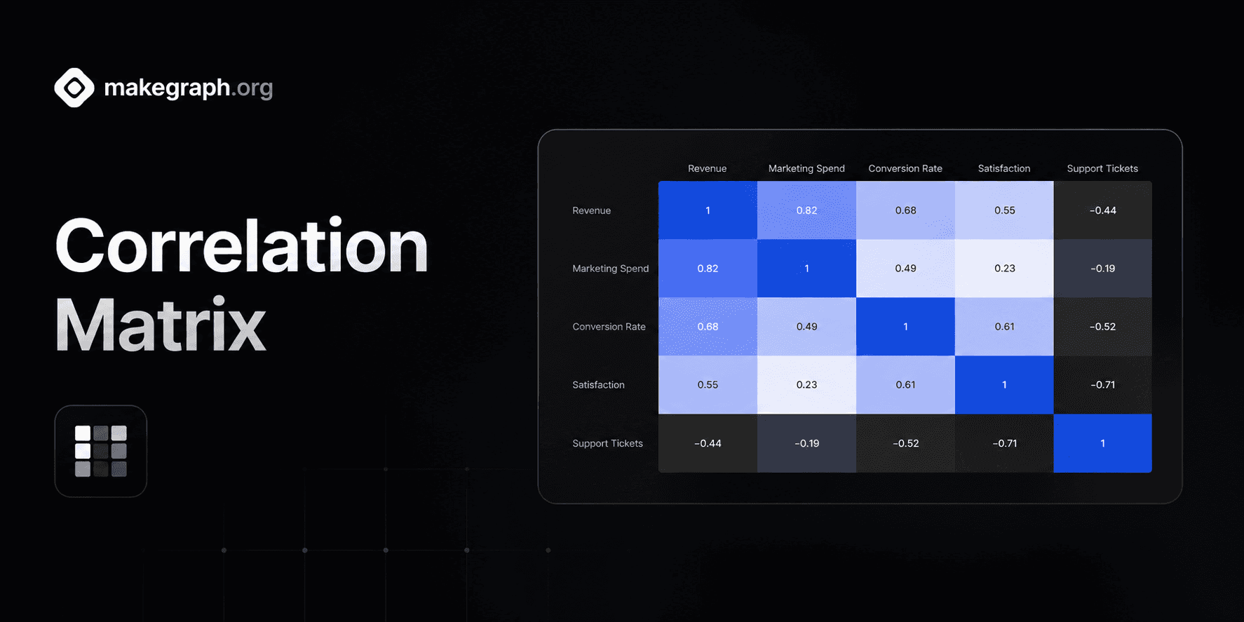
Correlation Matrix
Compare the strength and direction of each variable pair in one symmetric heatmap.
Why It Works
A correlation matrix condenses pairwise relationships into one compact heatmap, so teams can spot strong alignment, weak association, and inverse movement without scanning many separate plots.
Use one matrix to compare revenue, spend, retention, satisfaction, risk, or operational metrics side by side.
Edit variable pairs and correlation coefficients in a simple table, then let the matrix mirror each relationship symmetrically.
Keep the matrix readable with a fixed negative-to-positive scale and customize the positive highlight color to fit your brand.
Product Highlights
Enter variable X, variable Y, and a coefficient from -1 to 1 in the built-in table to update the matrix without leaving the editor.
The preview fills the symmetric side of the matrix and adds self-correlation on the diagonal, so the chart stays structurally complete while you edit.
Adjust the positive correlation color while the matrix keeps a readable fixed neutral and negative scale for fast interpretation.
Use the live preview as a polished heatmap that is ready for screenshots, reports, dashboards, or presentation slides.
Common Use Cases
Compare marketing spend, conversion rate, revenue, and retention in growth reporting.
Review portfolio factors such as volatility, return, exposure, and drawdown in finance workflows.
Analyze employee survey dimensions such as trust, workload, satisfaction, and intent to stay.
Check product metrics like session length, feature adoption, churn, and support volume together.
Map manufacturing indicators such as temperature, pressure, throughput, and defect rate.
Summarize research variables before modeling so teams know which factors move together strongly.
You need to compare many variable pairs in one compact view instead of many separate charts.
The audience cares about relationship strength and direction rather than exact time sequence.
You want positive, neutral, and negative relationships to stand out immediately through color.
You already have correlation coefficients or want to summarize a statistical analysis visually.
You want to inspect raw point distribution and a scatter chart is more informative.
You need to show trend over time and a line chart tells the story more clearly.
You only need to compare magnitudes by category and a bar chart is simpler to read.
The audience needs exact numerical tables rather than an overview of relationship patterns.
Frequently Asked Questions
It is best for summarizing the relationship strength between many variables at once, especially when you want to compare positive and negative correlation in one matrix.
Enter a variable X name, a variable Y name, and a correlation coefficient between -1 and 1 for each pair you want to show.
A correlation matrix summarizes pairwise coefficients across many variables, while a scatter chart shows raw observations for one x-y relationship at a time.
Correlation is symmetric, so the relationship between A and B is the same as the relationship between B and A. The preview mirrors that automatically.
A correlation matrix summarizes the relationship between variables, so the inputs are variable names plus a coefficient, not raw scatter plot coordinates.
The chart still renders the matrix and leaves unspecified cells unfilled, which helps you see which relationships are available and which still need analysis.
Ready To Start
Enter metric pairs, adjust the matrix styling, and turn a list of coefficients into a heatmap that is easy to scan and share.