Online Sunburst Chart Tool
Free online sunburst chart maker. Visualize hierarchical part-to-whole data with concentric rings, customize labels and colors, and preview the structure instantly.
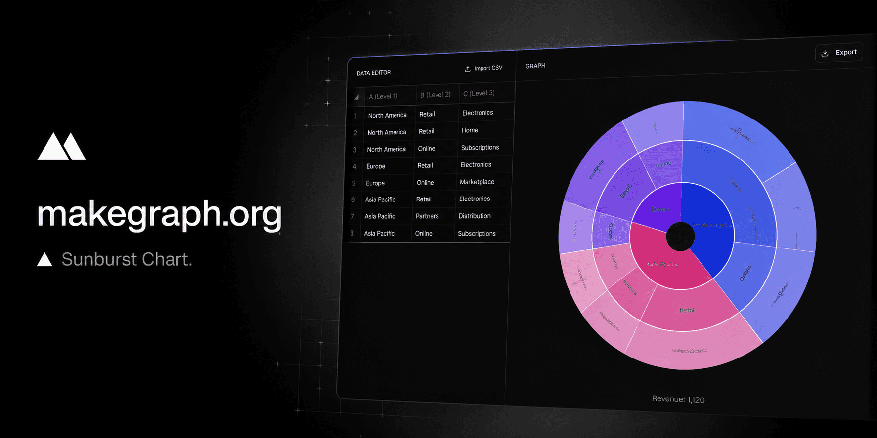
Revenue: 1,120
Top-level groups use distinct colors and children inherit lighter shades.
Why It Works
A sunburst chart helps people read both hierarchy and share at the same time, moving from the center outward without switching between multiple charts or tables.
See how top-level categories split into smaller groups while still preserving the total structure.
Follow parent-child paths from the center to the outer rings when you need to explain layered composition.
Compare structure and contribution in one compact view when a regular pie chart is too shallow.
A sunburst chart sits between a pie chart and a tree map: it keeps the circular part-to-whole feeling while exposing the path from parent to child.
Use it when your story is not only which category is largest, but also how that category splits into smaller pieces over multiple levels.
Product Highlights
Add one row per branch with up to three levels, then update names and values directly inside the editor.
As soon as you change a value or rename a node, the chart rebalances the hierarchy in the preview area.
Use distinct colors for top-level groups or keep the whole chart aligned to one theme color.
Keep labels visible for explanation-heavy charts or hide them when you want a cleaner export.
Common Use Cases
Break revenue into region, channel, and product group within one hierarchy.
Show website traffic from source to campaign to landing page.
Explain how a total budget flows from department to team to project.
Summarize product catalogs from category to subcategory to SKU family.
Present organizational structures where each ring adds a new level of detail.
Compare multi-level portfolio or inventory composition without using multiple nested charts.
Your data has a clear parent-child hierarchy with two to four levels.
You want to show both part-to-whole share and the path from parent to child.
You need a compact alternative to multiple pie charts or separate grouped tables.
Readers benefit from understanding how large categories split into smaller segments.
You only have one level of categories and a pie chart or bar chart is simpler.
You need precise comparison between similar values and a bar chart is easier to read.
Your labels are very long or the hierarchy is too deep for comfortable ring labeling.
You care more about space efficiency than path readability and a tree map fits better.
Frequently Asked Questions
A sunburst chart is best for showing hierarchical part-to-whole data when you need to explain both the overall share and how each category breaks down into subcategories.
A pie chart usually shows only one level of categories, while a sunburst chart adds multiple rings so you can display parent-child relationships in the same figure.
Most sunburst charts work best with two to four levels. Beyond that, the outer rings can become crowded and harder to label clearly.
Use a tree map when you want better space efficiency and area comparison. Use a sunburst chart when the parent-child path matters more than rectangle area.
Yes. You can keep later levels empty when a branch stops earlier than others, and the chart will still group the data correctly.
This tool focuses on fast table-based input, instant preview, and lightweight customization so you can create a clear sunburst chart without a heavier spreadsheet workflow.
Ready To Start
Enter your hierarchy rows, adjust the visual settings, and use the live preview above to turn layered data into a clear concentric chart.