Online Bar Chart Tool
Create bar charts and bar graphs online for category comparisons. Edit values, labels, and colors, preview instantly, and export clean visuals for reports.
Why Bar Charts Work
See which category leads, trails, or changes rank at a glance.
Turn grouped counts, sums, averages, or percentages into a bar chart people can scan quickly.
Use a bar graph to compare categories such as products, regions, channels, teams, or survey responses.
Keep ranked comparisons readable so people can spot the highest, lowest, and widest gaps without reading a full table.
Product Highlights
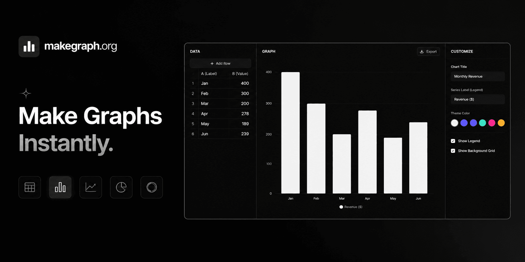
Update category names and values in a built-in table without leaving the bar chart workflow.
Adjust data and immediately see how the bar chart responds in the preview panel.
Control the bar chart title, legend name, color theme, legend visibility, and background grid.
Use the three-column editor on larger screens or the bottom sheet controls on smaller devices.
Common Use Cases
Compare product sales across categories or regions.
Summarize survey responses by answer option.
Show traffic, users, or conversions by channel.
Review monthly or quarterly performance by team, market, or campaign.
Present average scores, completion rates, or category-based percentages.
Highlight top and bottom performers in a ranked comparison.
Your data is organized into clear categories.
Your main goal is to compare values across groups.
Readers need to spot the highest, lowest, or ranked items quickly.
You are charting grouped metrics like count, sum, average, or percentage.
You want to show change over continuous time and a line chart fits better.
You want to show the distribution of continuous values and need a histogram.
You only care about part-to-whole share and a pie chart or 100% stacked bar chart is clearer.
You have too many categories and labels become crowded or hard to scan.
Frequently Asked Questions
A bar chart is best for comparing values across categories. It helps people quickly see which group is highest, lowest, or most important in a ranked comparison.
Bar charts work best with grouped or categorical data such as products, countries, channels, months, devices, teams, or survey answers.
Yes. If percentages are grouped by category, a bar chart is often a clear way to compare them side by side.
A horizontal bar chart is usually easier to read when labels are long or when you need to compare many categories in one chart.
A bar chart focuses on comparing separate categories, while a line chart is usually better for showing continuous trends over time.
A lightweight online bar chart maker is faster when your goal is to enter category data, preview changes instantly, and create a clean bar graph without a heavier spreadsheet workflow.
Ready To Start
Enter your categories, adjust the presentation, and use the live preview above to turn raw numbers into a bar chart that is easy to share and easy to understand.
