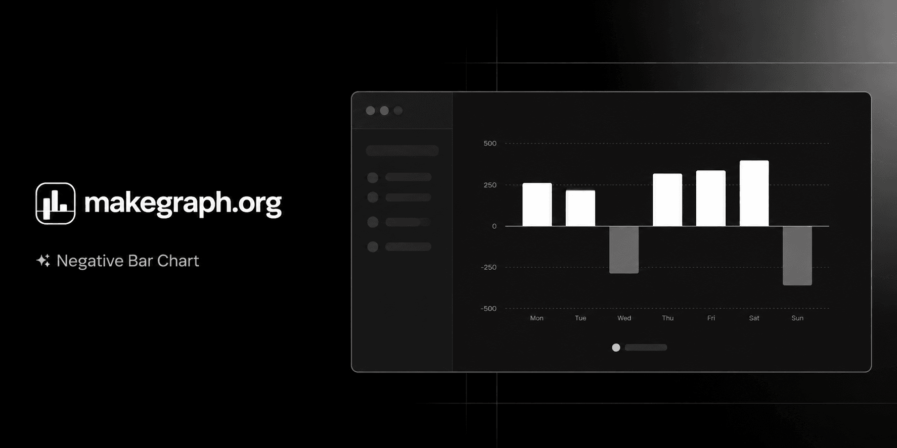
Online Negative Bar Chart Tool
Free online negative bar chart maker. Display positive and negative values across categories, customize labels and colors, and preview results instantly for reports and presentations.
Why Use It
A negative bar chart makes positive and negative performance easy to compare at a glance, so readers can quickly see which categories help, hurt, or stay near break-even.
Place profit and loss, surplus and deficit, or favorable and unfavorable variance on opposite sides of the same axis.
Keep direction and magnitude visible at the same time instead of forcing readers to infer negatives from labels alone.
Use one clean chart to explain contribution, drag, and balance across categories in finance, operations, and survey reporting.
Product Highlights
Update category names and positive or negative values in a built-in table without leaving the chart workflow.
Adjust data and immediately see how each bar moves above or below the zero line in the preview panel.
Control the chart title, legend name, theme color, legend visibility, and background grid for a clean analytical view.
Use the full editor on larger screens or the bottom sheet controls on smaller devices while keeping the same chart workflow.
Common Use Cases
Compare profit and loss by product, store, team, or region.
Show budget variance by department with favorable and unfavorable results around zero.
Visualize sentiment scores, net promoter segments, or review polarity by category.
Track monthly gains and setbacks across campaigns, channels, or business units.
Explain surplus versus deficit, increase versus decrease, or target versus shortfall in one view.
Highlight the strongest positive contributors and the biggest negative drags in a ranked comparison.
Your categories can contain both positive and negative values.
Your audience needs a clear zero baseline to judge direction and magnitude.
You want to compare contribution versus drag across categories in one view.
You are presenting metrics such as profit/loss, variance, balance, score, or net change.
You want to explain how step-by-step changes accumulate into a final total and a waterfall bar chart fits better.
You mainly want to show continuous trends over time and a line chart is clearer.
All values are positive and a regular bar chart communicates the comparison more simply.
You have too many categories and the labels become crowded or difficult to scan.
Frequently Asked Questions
It is best for comparing categories that include both positive and negative values, such as profit and loss, favorable and unfavorable variance, or sentiment scores above and below zero.
A negative bar chart uses a zero baseline and extends bars in opposite directions, making gains and losses easier to distinguish than in a chart that only emphasizes size.
Use a negative bar chart when you want to compare separate categories around zero. Use a waterfall chart when you need to explain how sequential increases and decreases build to a final total.
Yes. It works well for any grouped metric that can be above or below zero, including percentage-point variance, sentiment scores, balance values, or net change.
The zero line gives readers an immediate reference point, making it much easier to judge whether each category is positive or negative and how far it is from neutral.
This tool is faster when you want to edit signed values, preview changes instantly, and produce a clean negative bar chart without spending extra time on spreadsheet formatting.
Ready To Start
Enter your categories, add positive and negative values, and use the live preview above to turn raw numbers into a chart that is easy to compare, share, and understand.