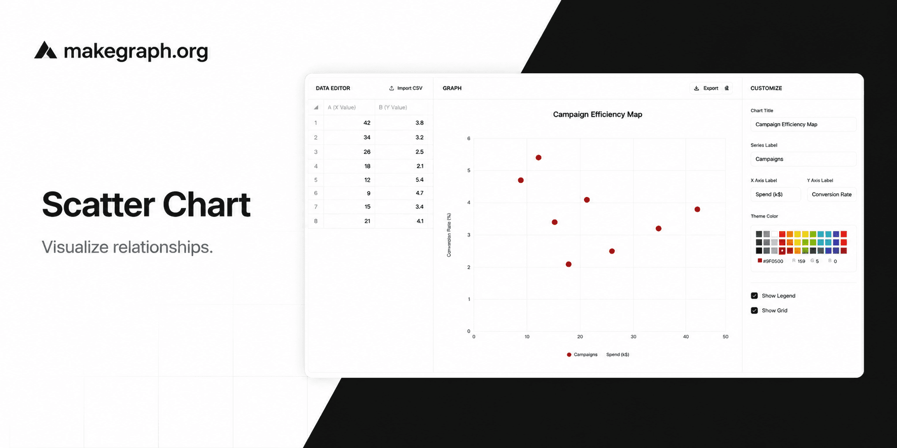
Online Scatter Chart Tool
Plot relationships between two numeric variables, edit x and y values in a table, and preview the result instantly.
Why It Works
A scatter chart helps people see whether two numeric measures move together, split into clusters, or contain unusual points worth investigating.
Map spend vs. conversion rate, price vs. demand, or time vs. score without forcing values into categories.
Edit numeric pairs in a simple two-column table and see the scatter plot refresh as soon as the values are valid.
Adjust the title, axis labels, theme color, grid, and legend to reuse the same chart for analysis, decks, or reports.
Product Highlights
Update numeric pairs in the built-in table so you can clean the data and refine the plot without leaving the editor.
The editor keeps the dataset focused on x and y only, which makes the scatter chart faster to fill in and easier to review.
Change the chart title, series label, axis labels, theme color, grid, and legend from the side panel in a few clicks.
See updates immediately while you edit, then export the current chart as a PNG for slides, docs, or status reports.
Common Use Cases
Compare advertising spend and conversion rate across channels or regions.
Plot product price against sales volume to see demand sensitivity.
Analyze study time vs. exam score across classes or student groups.
Review page load time vs. bounce rate to spot experience outliers.
Track risk vs. return for portfolios, funds, or investment ideas.
Compare machine settings vs. defect rate in quality-control workflows.
Both axes represent numeric variables rather than categories.
You want to inspect correlation, spread, or clusters instead of totals.
Outliers matter and you want them to stand out visually.
You want to adjust chart labels, grid, or legend quickly while keeping the plotting workflow lightweight.
You want to show a continuous trend over time and a line chart tells the story more clearly.
You only need category comparison and a bar chart is easier to scan.
Your audience needs exact sequential steps rather than relationship analysis.
The data has too few points for pattern detection or too many labels to read comfortably.
Frequently Asked Questions
It is best for showing the relationship between two numeric variables, especially when you want to inspect correlation, spread, and outliers.
You can edit the chart title, series label, x-axis label, y-axis label, theme color, grid visibility, and legend visibility.
A scatter chart focuses on relationships between points, while a line chart focuses on ordered progression or trend over time.
Yes. On smaller screens, the data editor and customize panel open in bottom sheets so you can still update the chart without leaving the page.
Yes. Use the export action in the preview area to download the current scatter chart as a PNG image.
Start with one x value and one y value for each point. Then add labels, title text, and styling in the editor as needed.
Ready To Start
Enter your x and y values, fine-tune the labels and styling, and use the live preview above to turn numeric pairs into a chart that is easy to review and share.