Online Confidence Interval Area Chart Tool
Build a confidence interval area chart online. Plot an estimate line with a shaded uncertainty band to show forecast range, regression intervals, or experiment results.
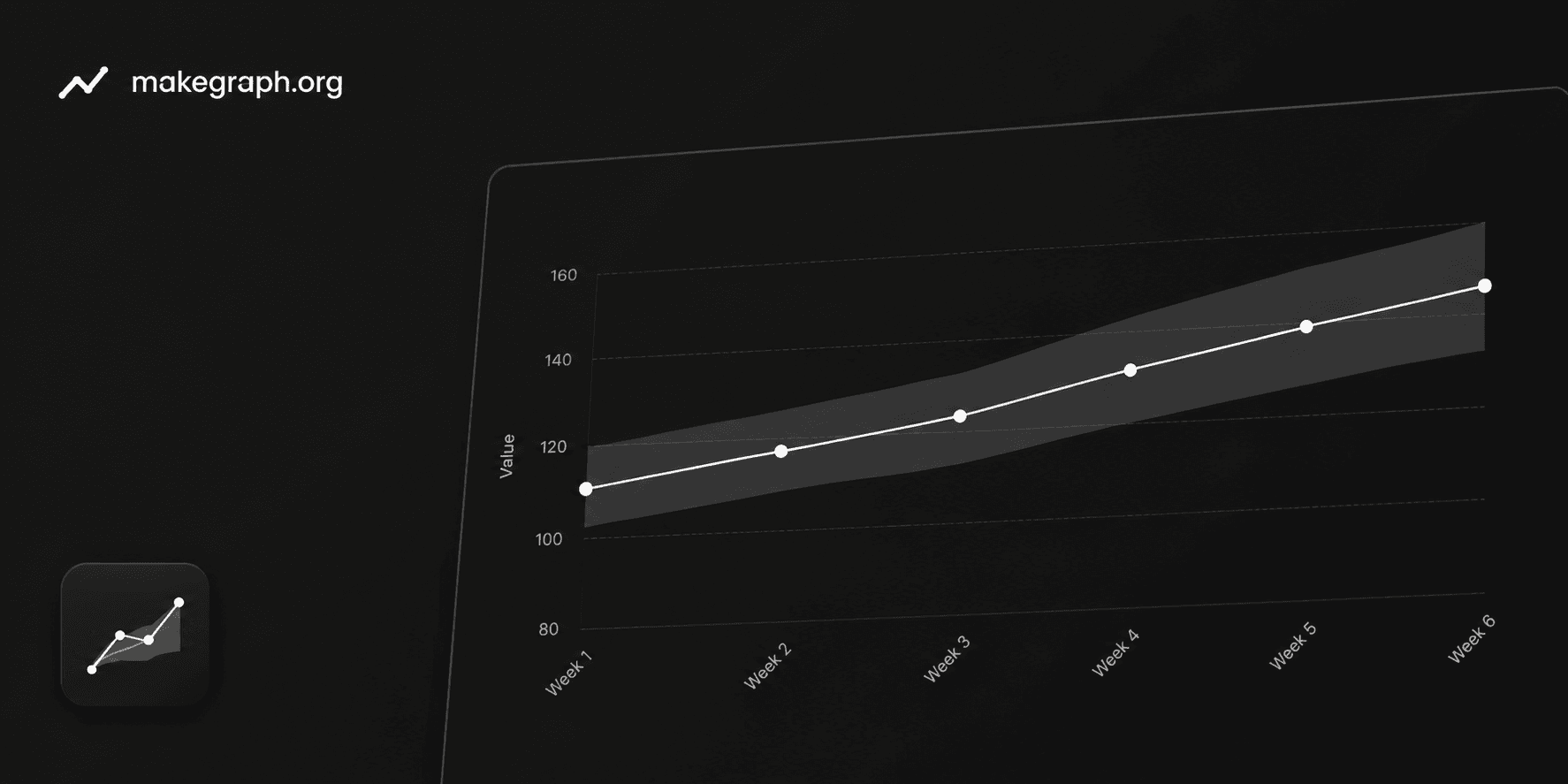
Why It Works
A confidence interval area chart pairs a central estimate line with a shaded band around it. Readers can see not only whether the estimate rises or falls, but also how wide the likely range is at each point.
Use one chart to explain the forecast path and the confidence range instead of splitting the story across multiple charts or tables.
A wider band signals more uncertainty, while a tighter band suggests the estimate is more stable or more reliable.
This format works well for time series forecasts, regression outputs, experiment summaries, polling ranges, and scientific reporting.
Product Highlights
Enter the label, estimate, lower bound, and upper bound in one table so you can adjust the interval without leaving the editor.
Every change updates the center line and the shaded confidence band immediately, making it easier to check whether the interval still tells the right story.
Adjust the chart title, line label, confidence band label, y-axis label, and line color from the side panel.
Use the full-screen desktop editor or the mobile bottom sheets to review uncertainty charts without a spreadsheet-heavy workflow.
Common Use Cases
Show demand, revenue, or traffic forecasts with a central prediction and a 95% confidence interval.
Present regression estimates across time or segments while keeping the uncertainty visible.
Summarize scientific or medical measurements with the mean trend and confidence bounds.
Visualize polling or survey estimates together with the likely range around each result.
Compare model outputs where the width of the interval matters as much as the estimate itself.
Explain experimental results when readers need both the direction of change and the uncertainty level.
You want to show an estimate or forecast together with its uncertainty range.
Readers need to compare how uncertainty changes across time, periods, or ordered stages.
A plain line chart would hide too much risk, variation, or statistical context.
You want a single chart that answers both what the trend is and how reliable it looks.
You only need to show the trend itself and a line chart is enough.
The data is categorical rather than ordered, so a bar chart communicates the comparison more clearly.
You need to compare distributions in detail and a box plot or violin plot fits better.
The audience needs exact interval values in a table more than a visual summary.
Quick Decision Guide
A line chart focuses on the direction of change. A confidence interval area chart shows the same trend together with the likely range, so readers can judge how stable or uncertain the estimate is.
If your question is
How does the trend change?
If your question is
How does the trend change, and how reliable is it?
You only have one value for each time point or stage and there is no lower or upper bound to show.
The audience mainly wants the direction, turning points, highs, and lows of the trend.
You are showing historical performance such as traffic, revenue, retention, or KPI tracking.
Adding uncertainty would create more noise than value for this decision.
You have an estimate plus a lower bound and an upper bound for every point.
You need to show forecasts, regression output, experiment summaries, polling ranges, or statistical results.
The audience needs to know not only the direction of change, but also how wide the likely range is.
A plain line chart would make the conclusion look more certain than the data really supports.
You want to explain risk, confidence, or uncertainty without forcing readers to inspect a table first.
Frequently Asked Questions
It is best for showing a central estimate and the uncertainty around it at the same time. The line explains the trend, and the shaded band explains how wide the likely range is.
They represent the lower and upper bounds of the interval for each point. Many teams use them for a 95% confidence interval, but the same chart can also show forecast ranges or similar uncertainty bands.
A normal line chart focuses on the estimate only. A confidence interval area chart adds a shaded band so readers can judge both direction and uncertainty instead of seeing a single path with no range.
Avoid it when you do not have a meaningful interval, when the data is not ordered, or when the audience only needs exact values. In those cases, a line chart, bar chart, or table may be simpler.
Yes. This chart is common in forecasting, regression analysis, scientific experiments, medical research, and reporting where confidence or uncertainty needs to stay visible.
Prepare one label plus three numeric values for each row: the estimate, the lower bound, and the upper bound. Then adjust the title, band label, and colors in the editor.
Ready To Start
Enter ordered labels, add the estimate and interval bounds, and use the live preview above to turn uncertainty data into a chart that is easier to explain and easier to trust.